Quick Nav
- The Challenge of Exhibiting Ecological Luxury
- Techniques 1 & 2: Tactile Topography and Scale
- Techniques 3 & 4: Atmospheric Renderings and Spatial Sequencing
- Technique 5: Integrating the Masterplan Vision
- Applying Exhibition Strategies to Your Portfolio
The Challenge of Exhibiting Ecological Luxury
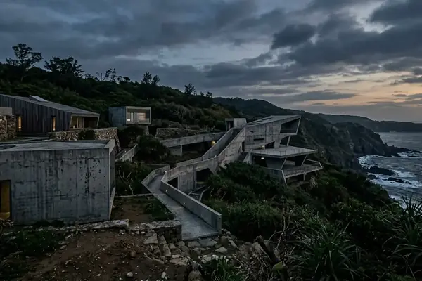
The Next-Gene 20 project united 20 world-renowned architects to design 20 distinct ecological villas on a single mountainous site in Taiwan. That single fact sets the stakes. Communicating a multi-author masterplan of this density to critics and luxury investors demands more than polished blueprints and a slide deck.
The curatorial team ran into the problem immediately. European exhibition halls offered footprints between 150 and 320 square meters. The Taiwanese terrain, with its long ascending approaches and layered ridgelines, refused to shrink politely into those rooms. Press tours moved from city to city; each stop required the physical context of the site to travel with the work, not as a caption but as a felt presence.
Logistically, that meant packing topography, material logic, and twenty independent design languages into temporary rooms that had never seen the mountain. Communicatively, it meant persuading an audience that had never walked the path that the villas belonged to one curated ecosystem rather than twenty disconnected statements. The exhibition had to carry landscape, climate, and collective ambition across borders without flattening any of them.
Techniques 1 & 2: Tactile Topography and Scale
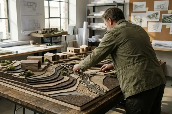
Large-scale physical models did the first heavy lift. At 1:50 and 1:100, the villas sat on CNC-milled topographical bases cut from reclaimed timber, with depth variance running from 45 to 120 millimeters. Viewers could read how each house gripped slope, how ridgelines steered sightlines, how the twenty volumes shared one continuous ground plane.
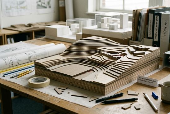
Material choice mattered as much as scale. Early tests leaned toward rapid-prototyped white acrylic for uniformity across all twenty designs. Those mock-ups looked clean and dead. The team switched to raw wood and textured resin. Grain, weight, and slight surface irregularity signaled ecological sensitivity in a way sterile plastic never could. Critics could touch the base and understand the argument before reading a single plaque.
Timber Over AcrylicWhen a model base feels like landscape rather than product packaging, structural viability and site integration become easier to trust. Hands confirm what drawings only assert.
Physical scale models remain the tool architectural critics reach for first when judging whether a scheme can stand on real ground. Digital fly-throughs impress; timber topography persuades.
Techniques 3 & 4: Atmospheric Renderings and Spatial Sequencing
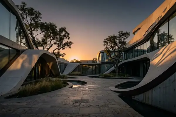
Walk a gallery that opens on a bright noon rendering of a glass pavilion, then turns a corner into a monsoon-dusk interior, and the sequence itself starts to argue for the project. That was the third technique: atmospheric, photorealistic digital work calibrated to specific site conditions, including the monsoon-season light diffusion from circa 4:00 PM to 5:30 PM on the Taiwanese slopes. Standard CAD outputs were set aside. Mood, weather, and hour became part of the evidence.
Atmospheric renderings build emotional resonance quickly. They are also limited in proving structural truth. Rigorous engineering critics treat them as mood boards until physical models anchor the claim. That pairing—render for feeling, model for fact—kept the exhibition credible rather than theatrical.
The fourth technique shaped the room itself. Curators studied the natural approach to the Next-Gene 20 site: a winding, ascending path. They translated that path into a staggered 45-degree zigzag gallery progression. Visitors climbed through the narrative the way a guest would climb the mountain. Spatial sequencing turned circulation into argument.
Host-Gallery LightAdjust lighting temperature in the exhibition space to the ambient daylight of the host gallery. Mismatched color temperature throws glare across calibrated renderings and undoes hours of careful mood work.
One failure case clarified the boundary. Teams that leaned solely on hyper-realistic VR walkthroughs watched older luxury investors step back—spatial disorientation and motion sickness cut the pitch short. The zigzag path and the physical models kept bodies oriented while the renderings supplied atmosphere.
Technique 5: Integrating the Masterplan Vision
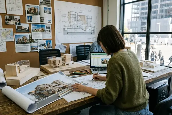
Twenty independent architectural voices can read as a student showcase if the frame around them is weak. The presentation team ran a visual audit of every submitted board, then imposed a single sans-serif typeface family across all twenty project plaques. Standardized A0 and A1 boards shared identical margin structures. Individual authorship stayed legible; the masterplan identity held.
Visual consistency does quiet work in a room full of investors. A large-scale luxury development has to feel like one curated ecosystem. Unified graphic standards and typography tell the audience that the twenty villas were commissioned into a shared logic, not assembled after the fact. The eye registers order before the ear hears the pitch.
Compare two walls: one a patchwork of fonts and margin widths, the other a disciplined field of related boards. The second wall sells the idea that the mountain holds a community, not a catalog. That is the difference between a collection of homes and a place.
Applying Exhibition Strategies to Your Portfolio
Global tour methods scale down. Design professionals and students facing a 45- to 90-minute client window can borrow the same hierarchy without booking a hall in another country.
- Audit the room first—table size, daylight, how many people will stand versus sit.
- Bring a portable 1:200 scale model that fits a boardroom table; let hands confirm site logic before slides begin.
- Pair two or three atmospheric stills, timed to real light conditions on your site, with that physical piece so mood never outruns structure.
- Hold type and margins steady across every board so the work reads as one proposition.
- Treat the presentation path as a designed sequence: open with terrain, move through atmosphere, close on the collective frame.
A small timber base on the table often outperforms a full VR headset when the decision-makers prefer to point, pause, and argue over a shared object.
Balance tactile evidence with digital atmosphere in every ordinary pitch. The presentation is itself a spatial experience, whether the project spans a mountain or a single lot. Sequence the room the way you would sequence a site visit.
When the next investor walks in, will the first thing they touch be a model that tells the truth about the ground—or a screen that only tells them how it might feel?